Cause 01
Cognitive overload
100+ biomarkers, no hierarchy. People can’t tell what matters from what’s noise.

Lumen is a concept preventive-health platform. This case study redesigns the moment after a person receives their results; where they either act, or quietly disappear.
01 — The Problem
After completing a biomarker test, many users never follow a recommendation, book a follow-up, or return to the product. That hurts their health outcomes and undermines any platform built on long-term engagement. The breakdown isn’t one thing; it’s four compounding failures at the results reveal.
Cause 01
100+ biomarkers, no hierarchy. People can’t tell what matters from what’s noise.
Cause 03
Results read as data, not direction. The report ends exactly where the user’s question begins.
Cause 02
Technical jargon with no context on what a marker means — or why anyone should care.
Cause 04
Unexpected results can trigger distrust and disengagement, especially after a history of “all clear.”
02 — Framing
This is a comprehension and motivation problem, not a re-engagement problem. Notifications and reminders don’t help someone who never understood their results in the first place. The highest-leverage moment is the reveal itself; the point where a person either engages or shuts down. So instead of designing a nudge system, I designed for the seconds when an anxious, first-time tester, at home, with no doctor in the room, opens their report.
03 — Principles
Diagnosis precedes pixels. The user’s emotional state at the reveal: anxious, overwhelmed, possibly distrustful — is the first design constraint.
Surface what matters first; progressively disclose the rest. Flagged biomarkers lead, the other ninety-something wait their turn.
Every result connects to a “so what do I do?” No biomarker is a dead end.
Status language and colour must carry the core reframe of preventive health: being fine is not the same as being well.
Action without feedback doesn’t sustain. Motivation is designed, not assumed.
04 — The Design
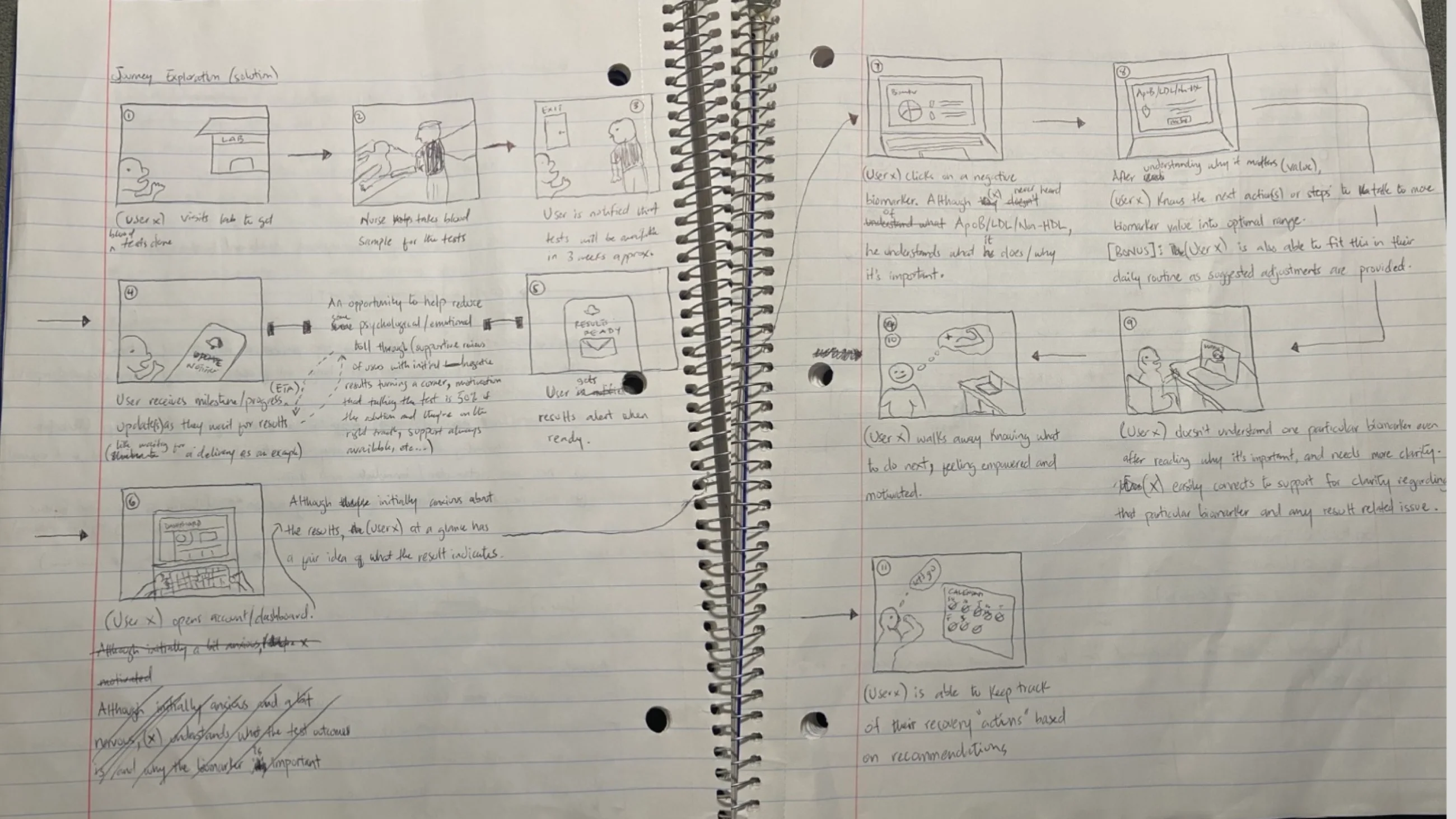
The journey was rebuilt around a loop instead of a report: flagged results surfaced first, every marker bridged to an action, every action tied to visible progress.
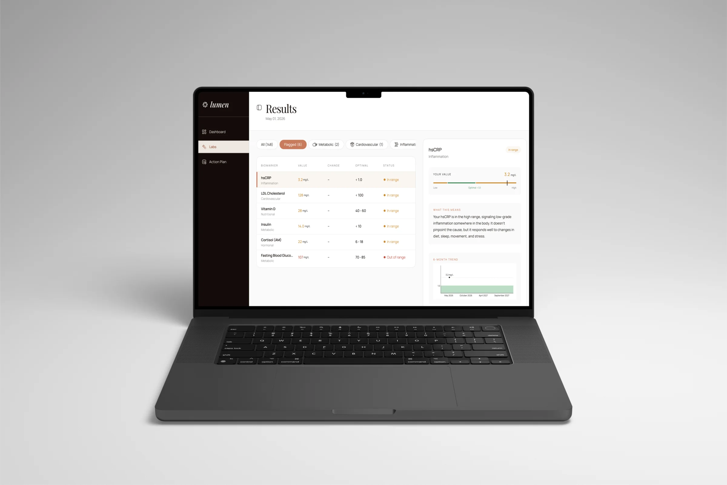
A dense report becomes a legible, prioritised view. The detail panel answers four questions in strict sequence: what is it, where am I, what does it mean, and what happens if I do nothing — ending in a single CTA that bridges straight into the action plan.
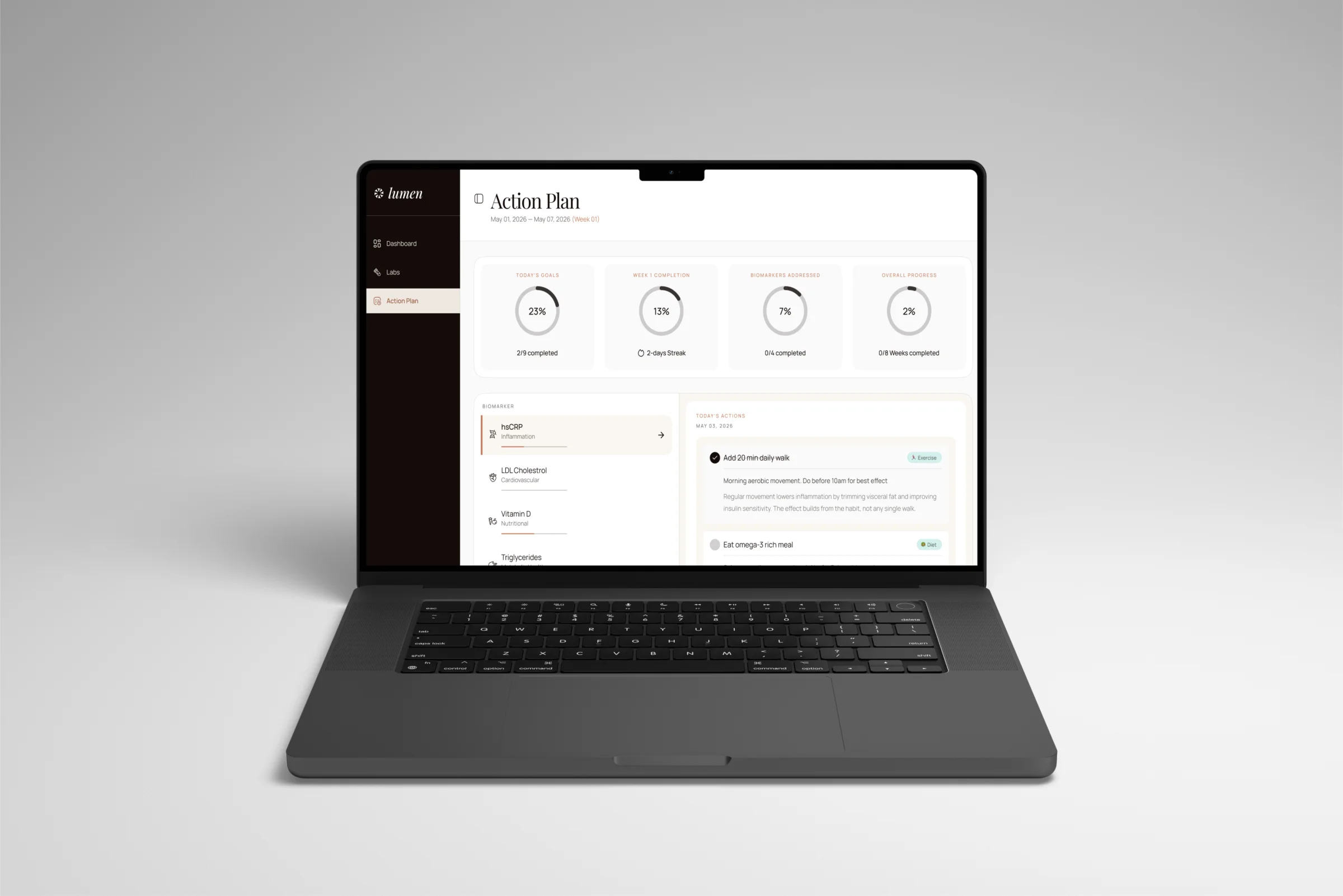
Understanding converts into a trackable set of actions, grouped by biomarker and tied to reasons, so it never reads as a generic to-do list.
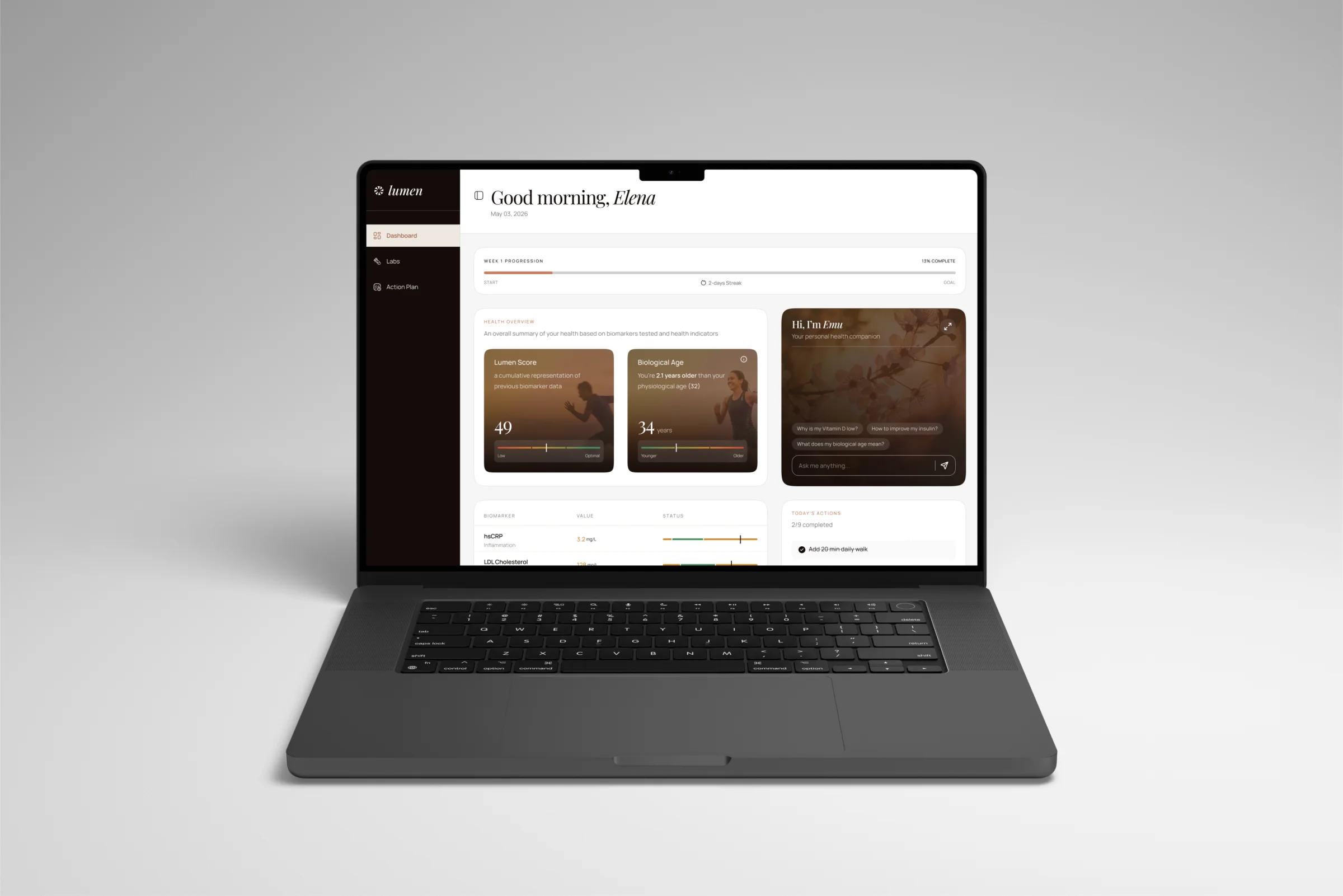
The daily touchpoint. A hundred-plus biomarkers collapse into one comprehensible number, anchored by biological age — with today’s actions on the home screen, not buried in a sub-page.
“Normal” reassures, and reassurance is exactly the wrong message for a value that’s merely acceptable. The status system from the results screen says “in range” instead, preserving the gap between fine and optimal that preventive health depends on. It’s a one-word decision that carries the entire product thesis.
05 — Measurement
As a concept, there are no shipped numbers, so the success criteria are defined up front, mapped to each sub-goal. What to ship first: the Results → Plan flow, since it attacks the core problem directly; the Dashboard follows as the retention layer once the primary loop is validated.
Follow Recommendations
Book Follow-ups
Re-engage
06 — Trade-offs
Risk-of-inaction tone. Too blunt induces anxiety; too soft fails to motivate. This copy might need refinement and A/B testing before it ships anywhere near a real person’s results.
Content dependency. The action recommendations assume a clinically validated personalisation layer exists behind them.
Desktop-first. Chosen because a 100+ marker report with a detail panel favours a wider viewport, but a real build needs full responsive design.
A notification and email nudge system was deprioritized because it addresses the symptom (people not returning) rather than the root cause (people not understanding).
A guided walkthrough overlay was set aside as it adds friction without fixing the underlying information architecture.
Future work covers the returning-user reveal, full state coverage, mobile, and comprehension testing of the risk-framing language.